Reframing a Business
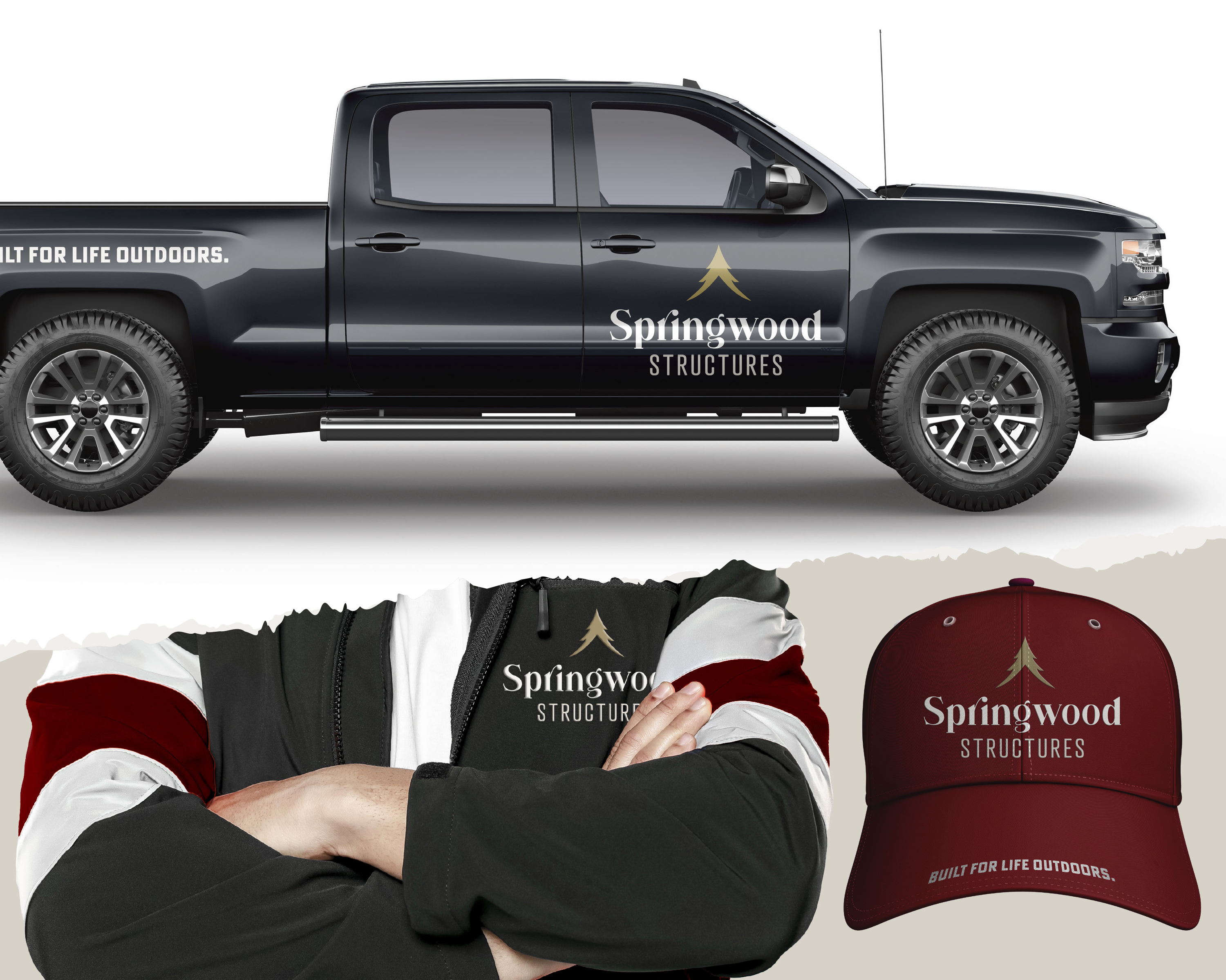
A refreshed brand identity was developed for an Amish builder of sheds, garages, and other backyard structures. Inspired by the client’s appreciation for texture and handcrafted detail, the goal was to create a visual system that felt timeless, dependable, and rooted in quality workmanship. Natural textures, hand-drawn accents, and weathered elements gave the brand a sense of warmth and authenticity, while the symbolic logo direction created a more distinctive and enduring identity.
The Challenge
The client initially gravitated toward a very literal logo direction centered around a direct shed illustration—an approach heavily used throughout the industry. The challenge became guiding the identity toward something more distinctive and enduring while still feeling familiar and approachable. The mark needed to communicate craftsmanship, nature, and trust in a more symbolic and memorable way.
My Approach
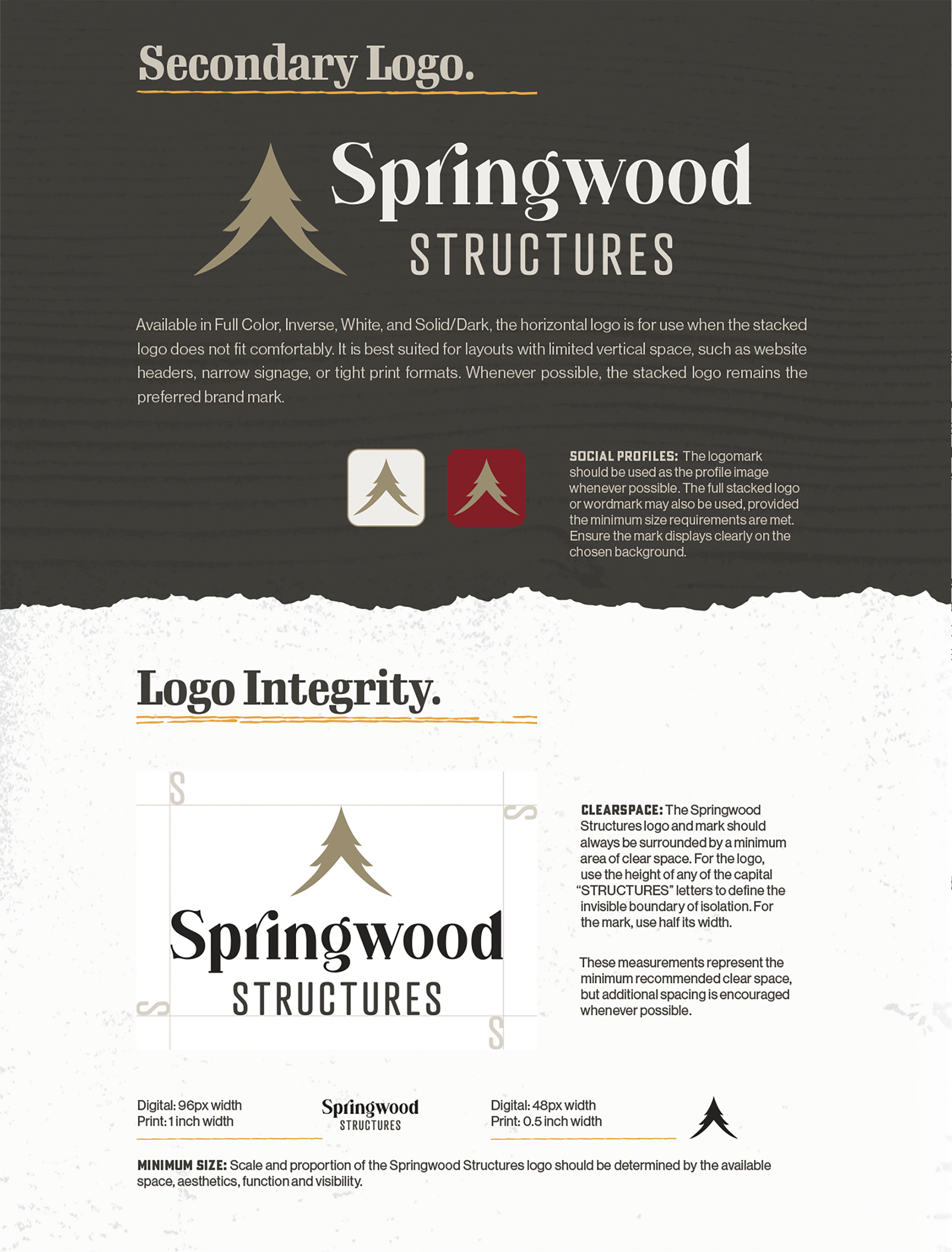
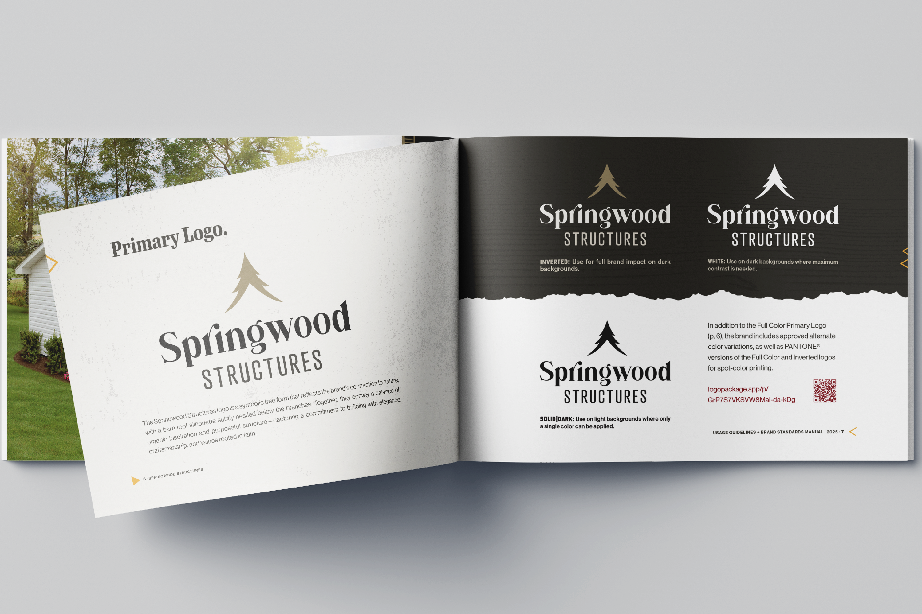
Rather than focusing directly on the structures themselves, the concept centered on the environment they belong in. The final mark uses a symbolic tree form to represent growth, nature, and enduring craftsmanship, with a barn roof silhouette subtly integrated beneath the branches. This balance of organic and structural elements created a mark that feels intentional, reflecting the company’s commitment to quality and purposeful building.
Key Concepts
Design that moves beyond literal pictorial branding while still feeling rooted in craftsmanship and outdoor living.
- Tree-based logomark represents growth, nature, and craftsmanship with subtle structural references.
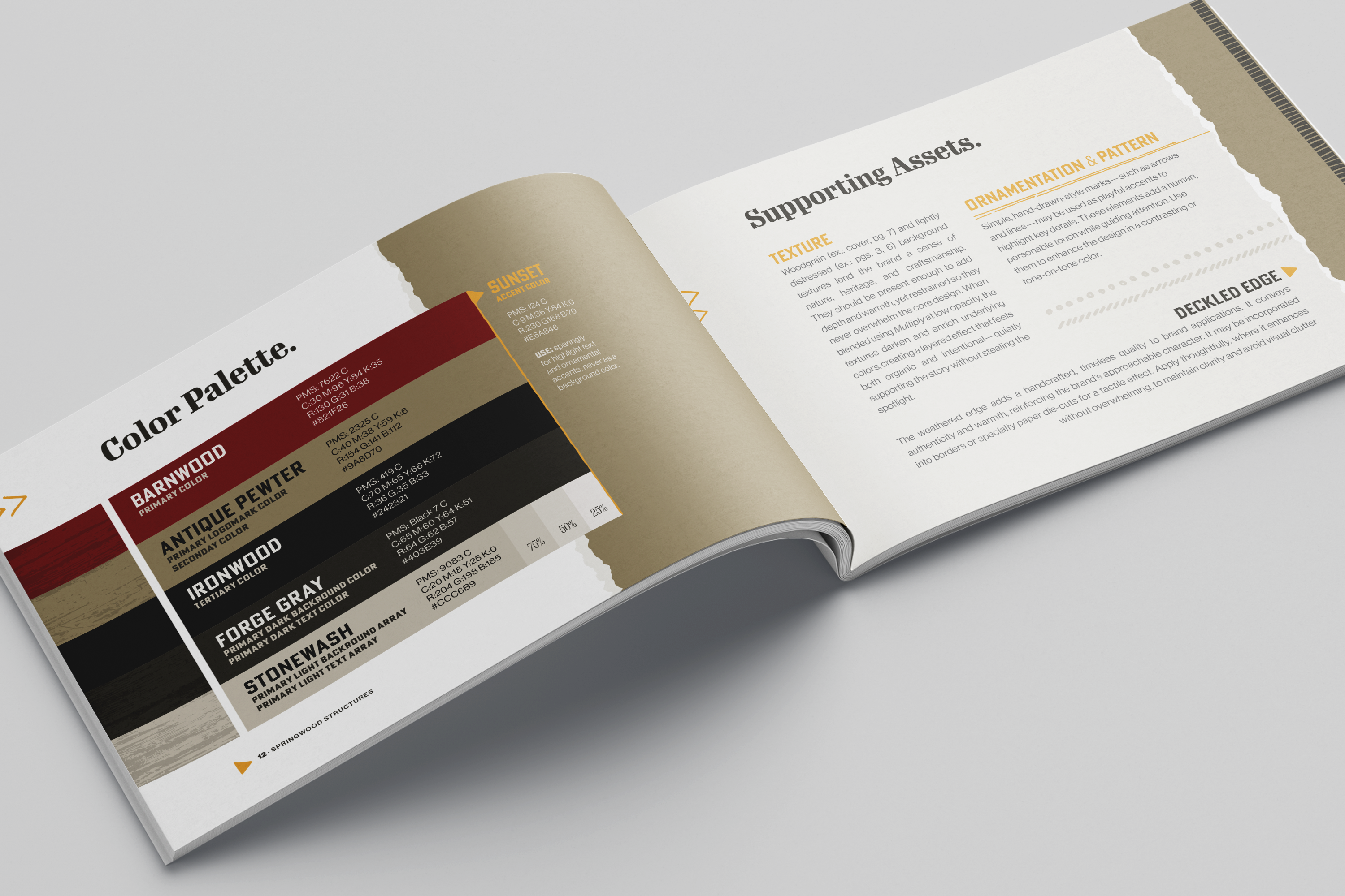
- Warm palette featuring deep maroon—a client favorite—and an occasional yellow pop for contrast and character.
- Layered woodgrain and lightly distressed textures add warmth, depth, and a handcrafted feel across applications.