What's in a Name
As a business rooted in the Plain Community, this client called for a thoughtful approach to tone, audience, and visual identity. Their values, including humility and service, guided every step of the process. Far into the design concepting, they discovered potential challenges around the uniqueness of their chosen name within their region, as well as trademark concerns. This prompted a strategic pivot.
The Challenge
The client had already selected a logo concept for their original name—simple, clean, and conceptually tied to the word itself. Then came the news that the name would need to change, while the core logo concept was to remain intact. Due to budget and time constraints, the existing design now had to adapt to entirely new text—without losing what made it work in the first place.
My Approach
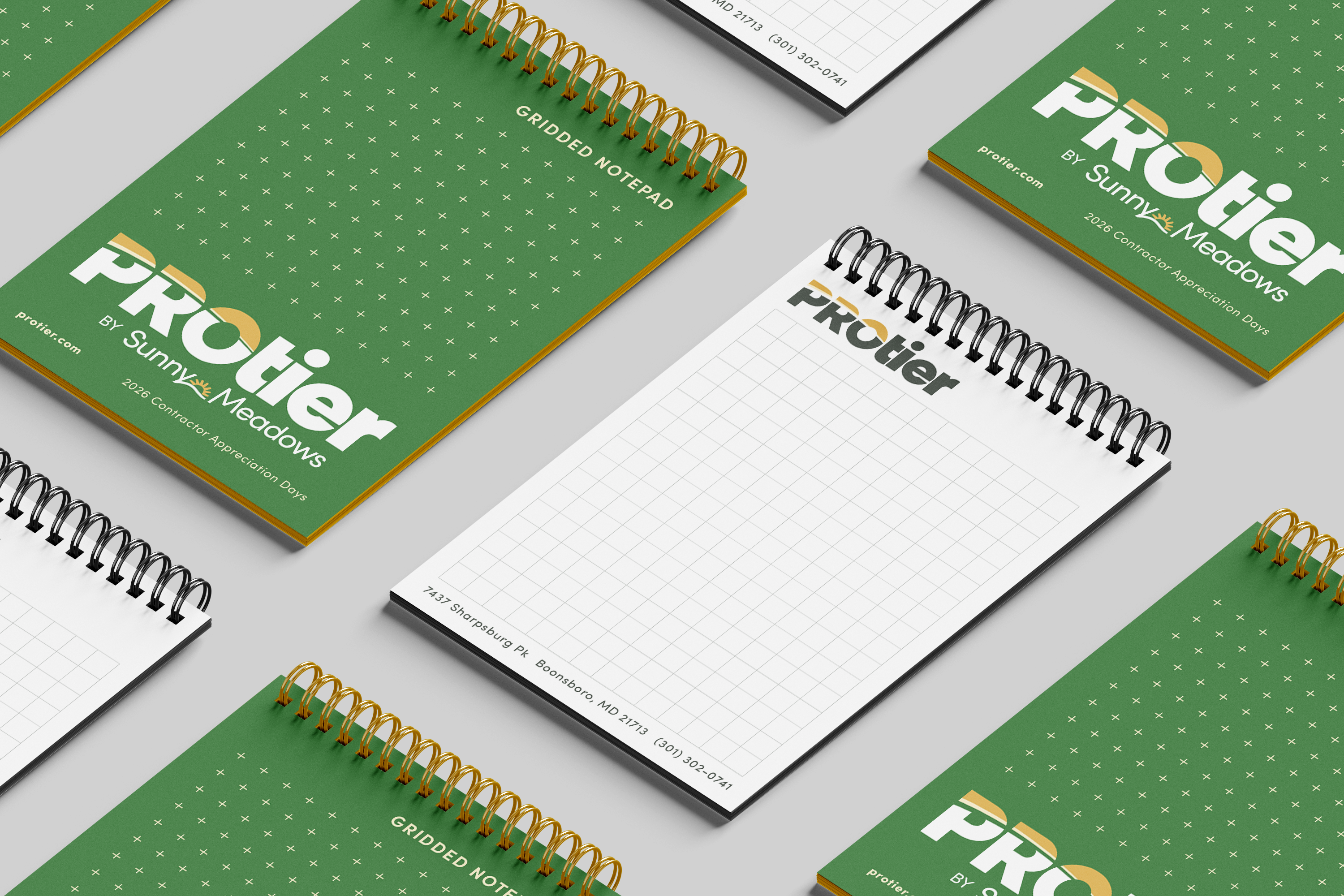
The sub-brand was expected to appear alongside its established parent company logo across many applications, heavily influencing the design direction. To create harmony between the two, I crafted a geometric wordmark that incorporated the design style they had already chosen, supported by a complementary color palette.
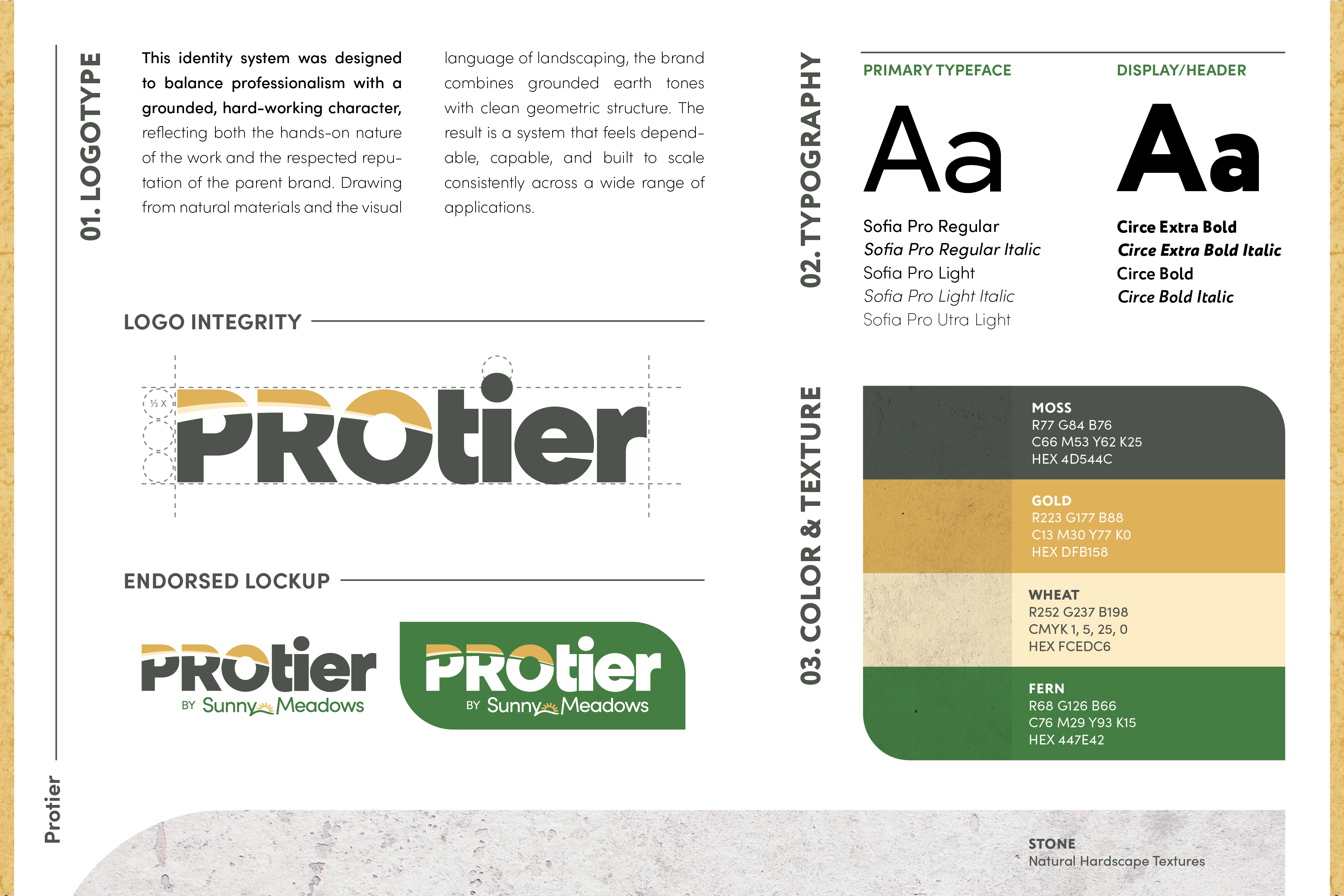
Key Concepts
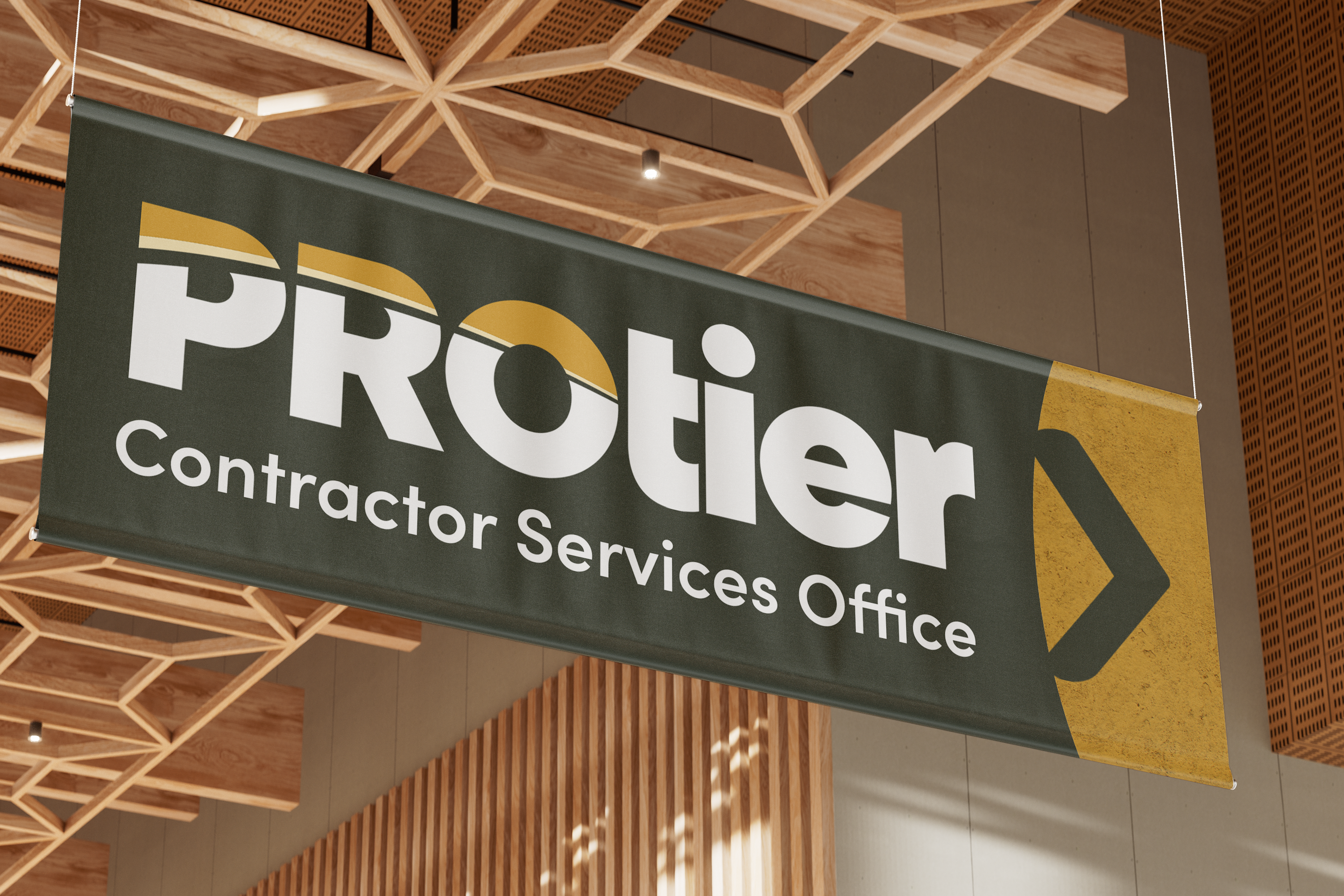
To distinguish the contractor division from the parent brand, the supporting visuals leaned into a more rugged, grounded aesthetic inspired by the materials and environment contractors work with every day.
- Simplified forms kept the identity clean, direct, and practical.
- Stone and gravel-inspired textures add grit and visual weight.
- Deeper greens and earth tones created a more durable, contractor-focused feel, while the shared gold accents reinforced the relationship between the two brands.