Savory Style
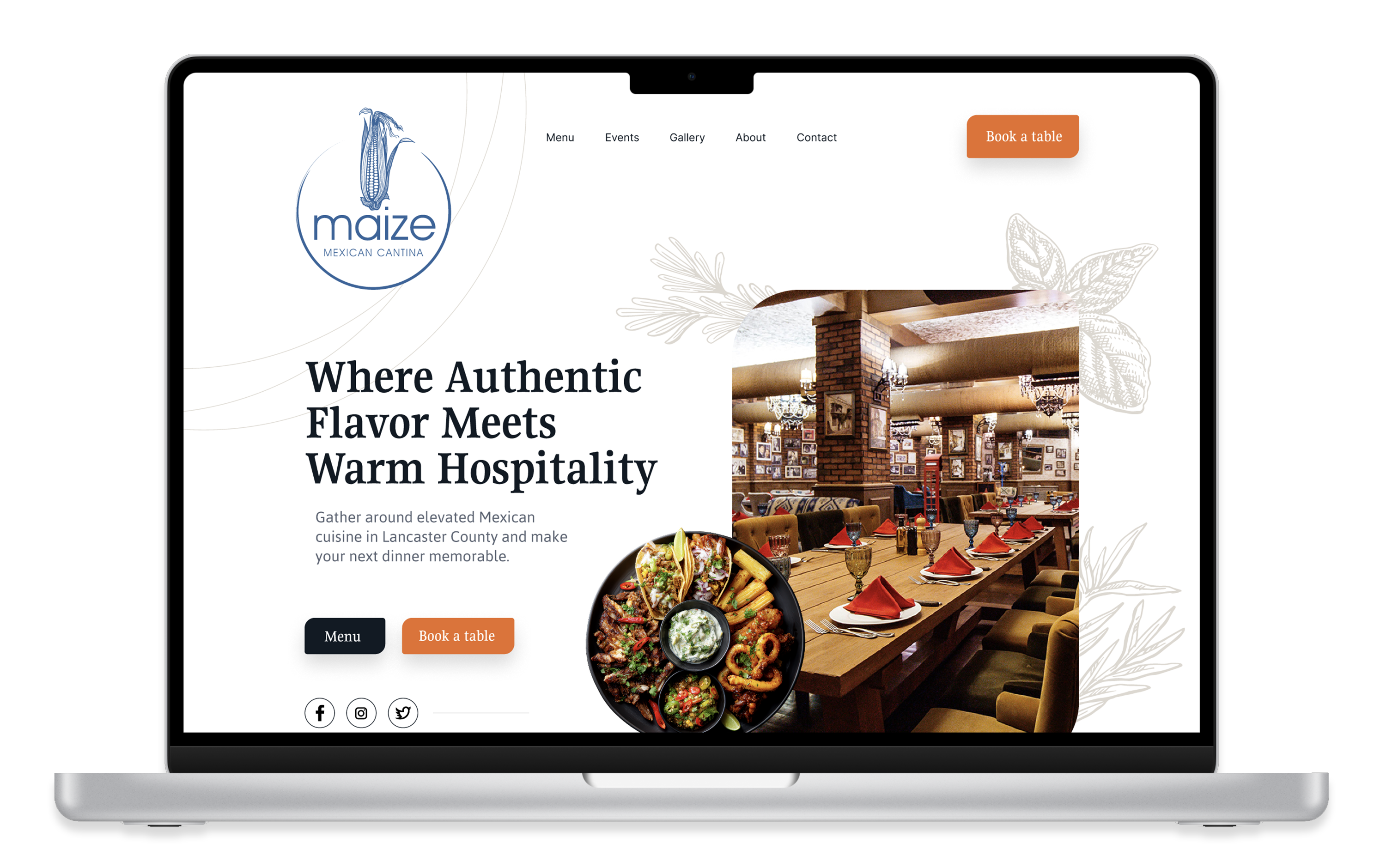
This project focused on developing a brand identity for a new dining concept. The goal was to create a visual identity that felt elevated and refined while still remaining approachable and welcoming to a broad audience. Clean typography, balanced composition, and understated detailing helped position the restaurant as a more polished experience without feeling overly formal or distant.
The Challenge
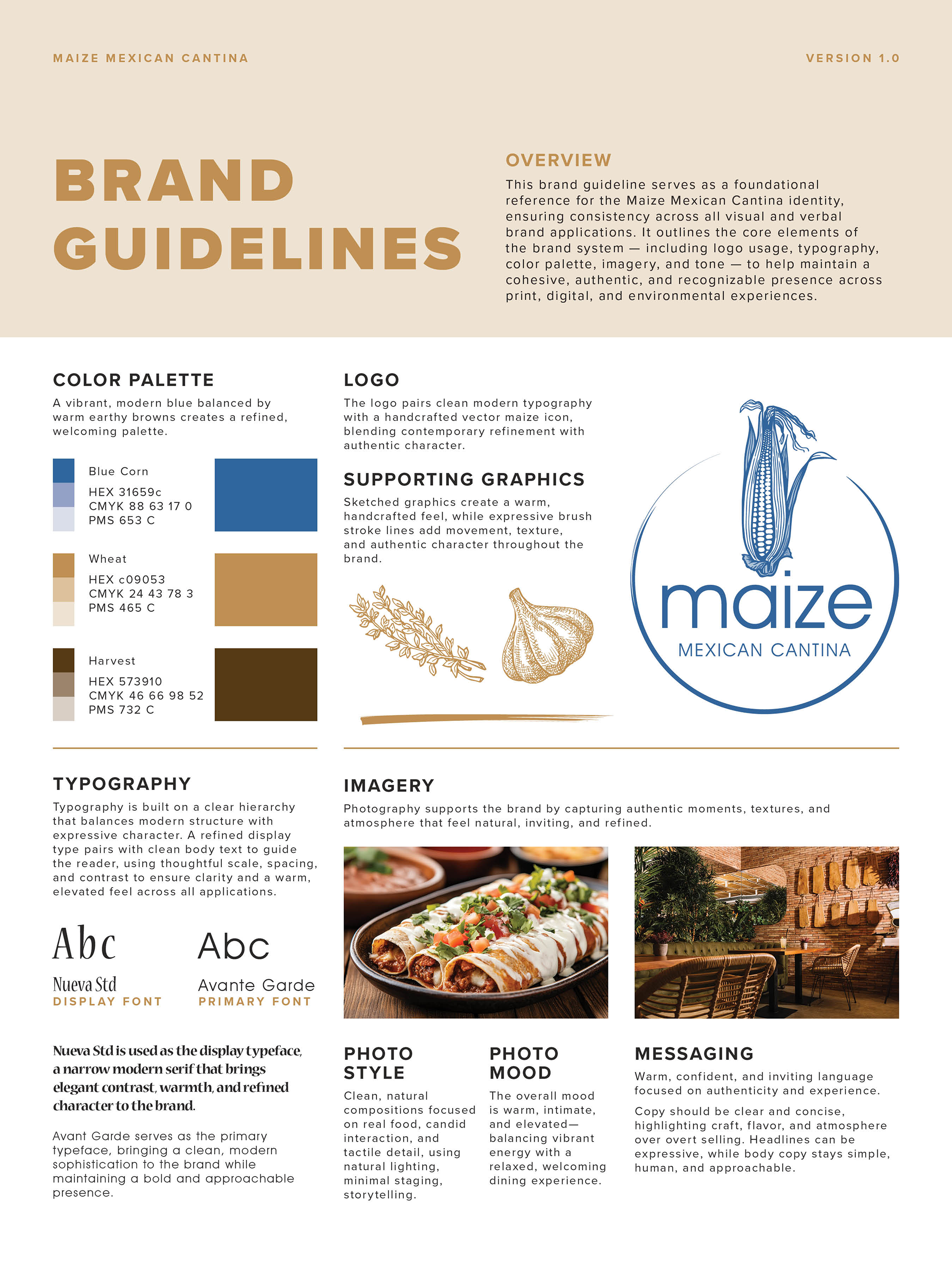
One of the primary challenges was incorporating the owner’s strong preference for the color blue without losing the warmth expected from a dining environment. Blue can often feel cold or corporate in restaurant branding, so the palette needed careful balance to maintain a comfortable, inviting atmosphere.
My Approach
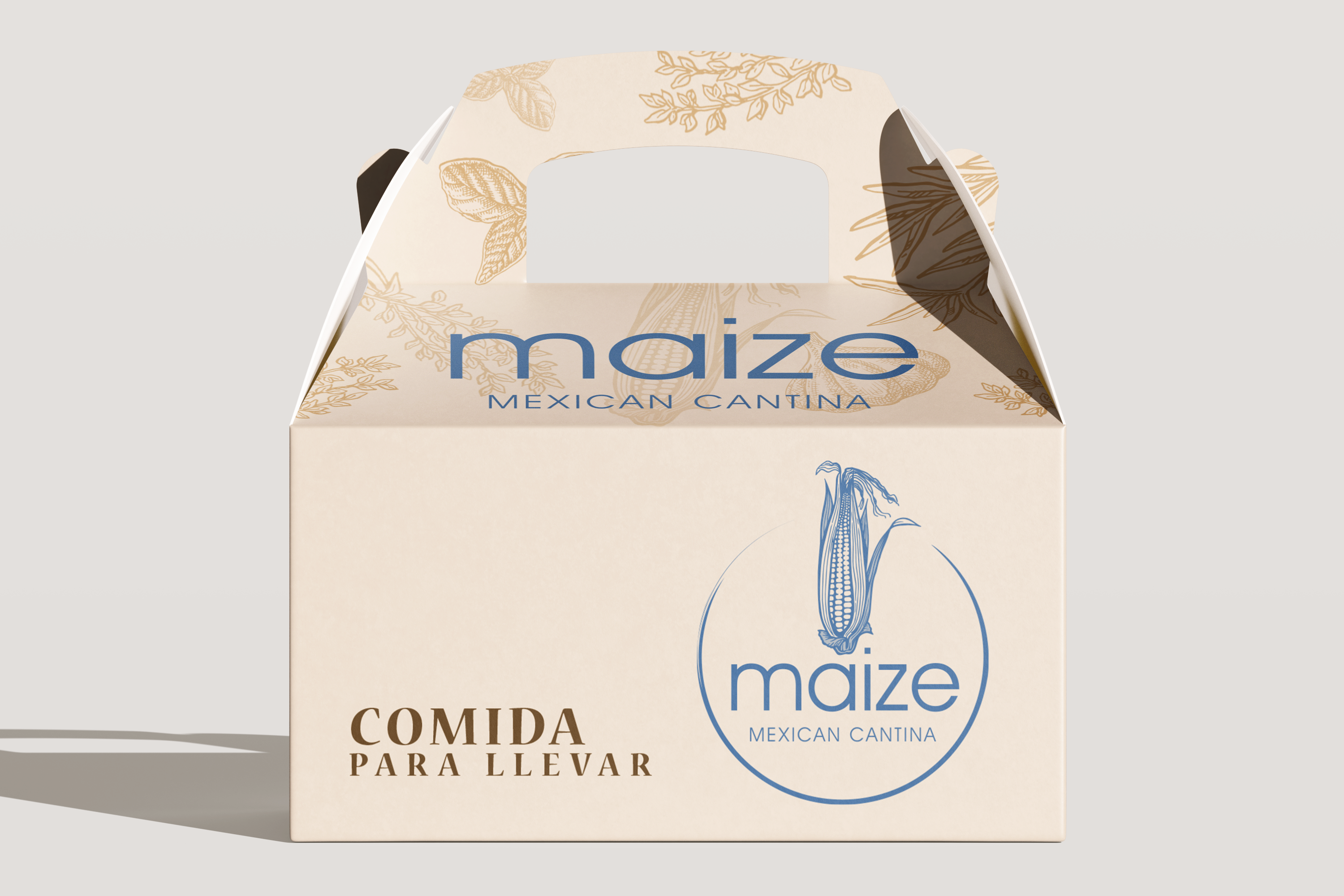
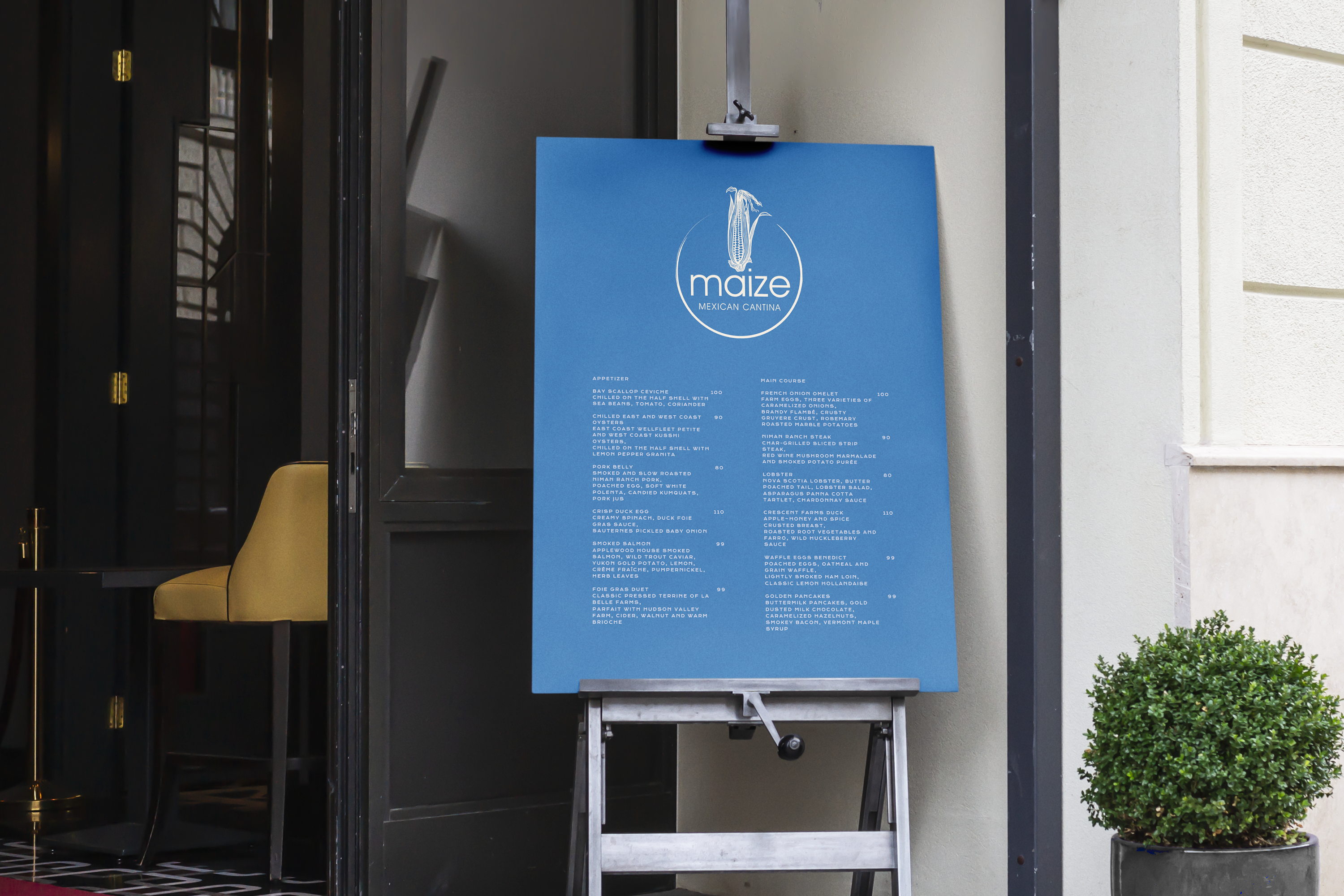
To soften and elevate the use of blue, it was paired with rich brown tones and warm neutrals inspired by natural materials and interior finishes. The identity system leaned into restrained typography, subtle contrast, and clean layouts to create a brand that feels both contemporary and comfortable. The result is a visual identity that balances sophistication with familiarity.
Key Concepts
Create a dining experience that feels polished, approachable, and visually distinct from the owners’ existing restaurant brands.
- Rich browns and warm neutrals balance the cooler blue palette with warmth and depth.
- Refined typography and restrained layouts create a more elevated dining atmosphere.
- Clean visual structure allows the brand to feel modern without becoming overly formal.