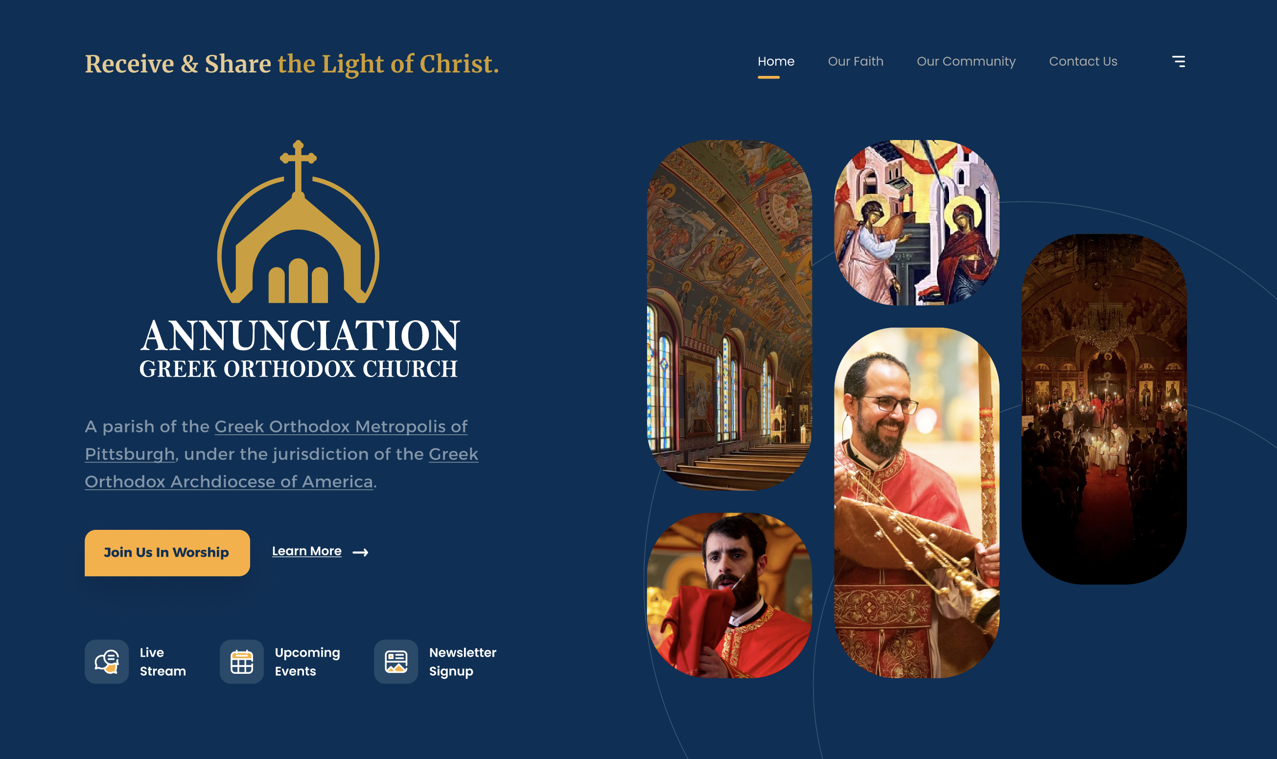
Ancient Roots, Present Voice
As a growing Orthodox parish, this church needed a visual identity that felt both rooted in ancient tradition and approachable to a modern audience. The project required a careful balance between reverence and clarity, drawing from the rich symbolism, structure, and history of the Greek Orthodox faith while creating a system that could live naturally across contemporary applications. Every design decision was shaped by the goal of honoring the Church’s timeless foundation without feeling visually distant or outdated.
The Challenge
The church had little visual consistency, with no established logo or recognizable system to build from. Each ministry and department created their own materials—letters, flyers, web banners—using random fonts, styles, and layouts. The challenge was to create something modern, approachable, and easy for a wide range of contributors to apply, while still honoring the depth, symbolism, and reverence of the Orthodox Faith.
My Approach
To establish a cohesive visual identity while introducing a sense of quiet modernity, I focused on building a system that feels reverent in tone, yet clear and functional in practice—capable of living across both print and digital environments. The design balances restraint with meaning, allowing symbolism and structure to guide the overall form.

Key Concepts
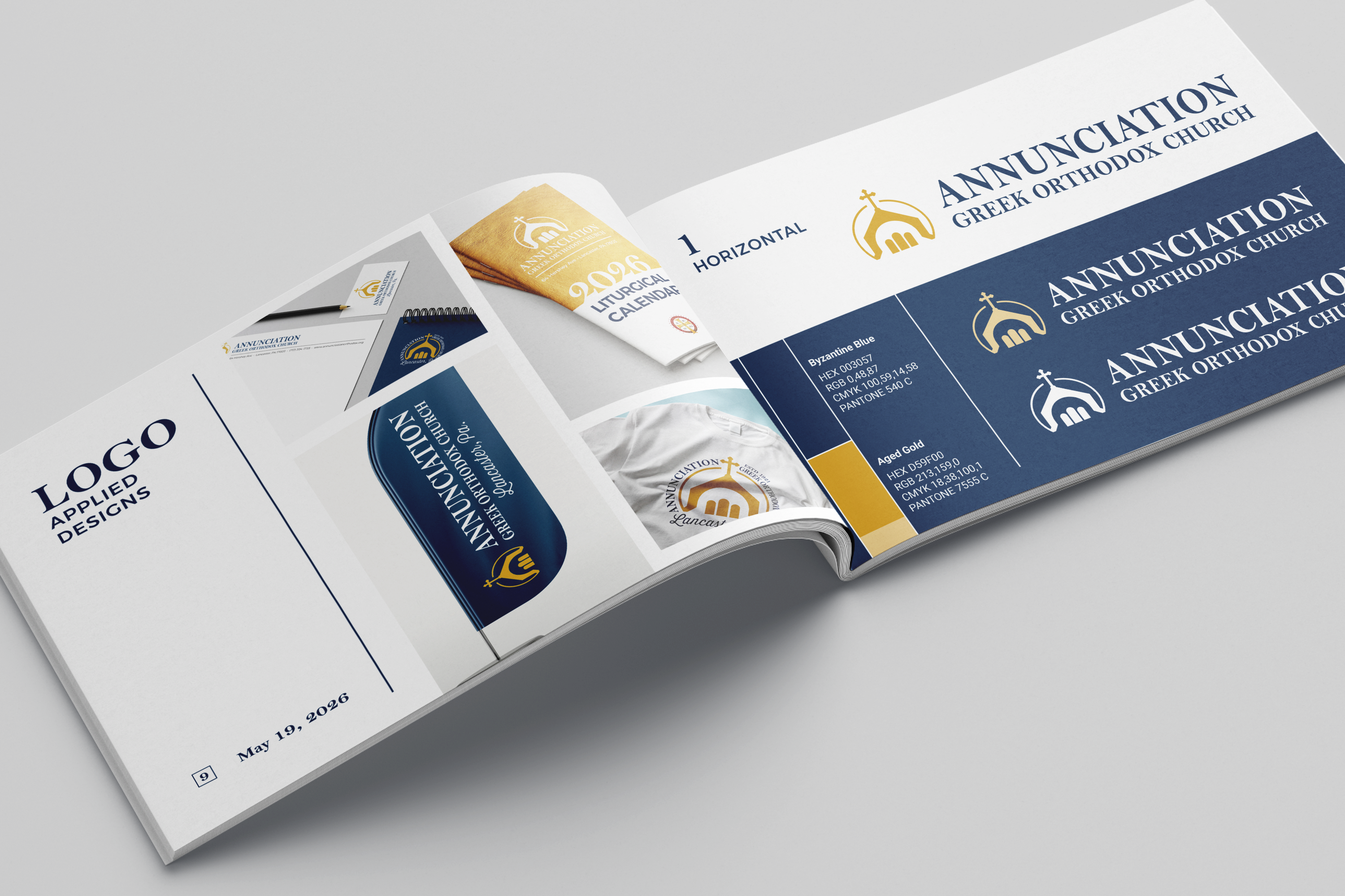
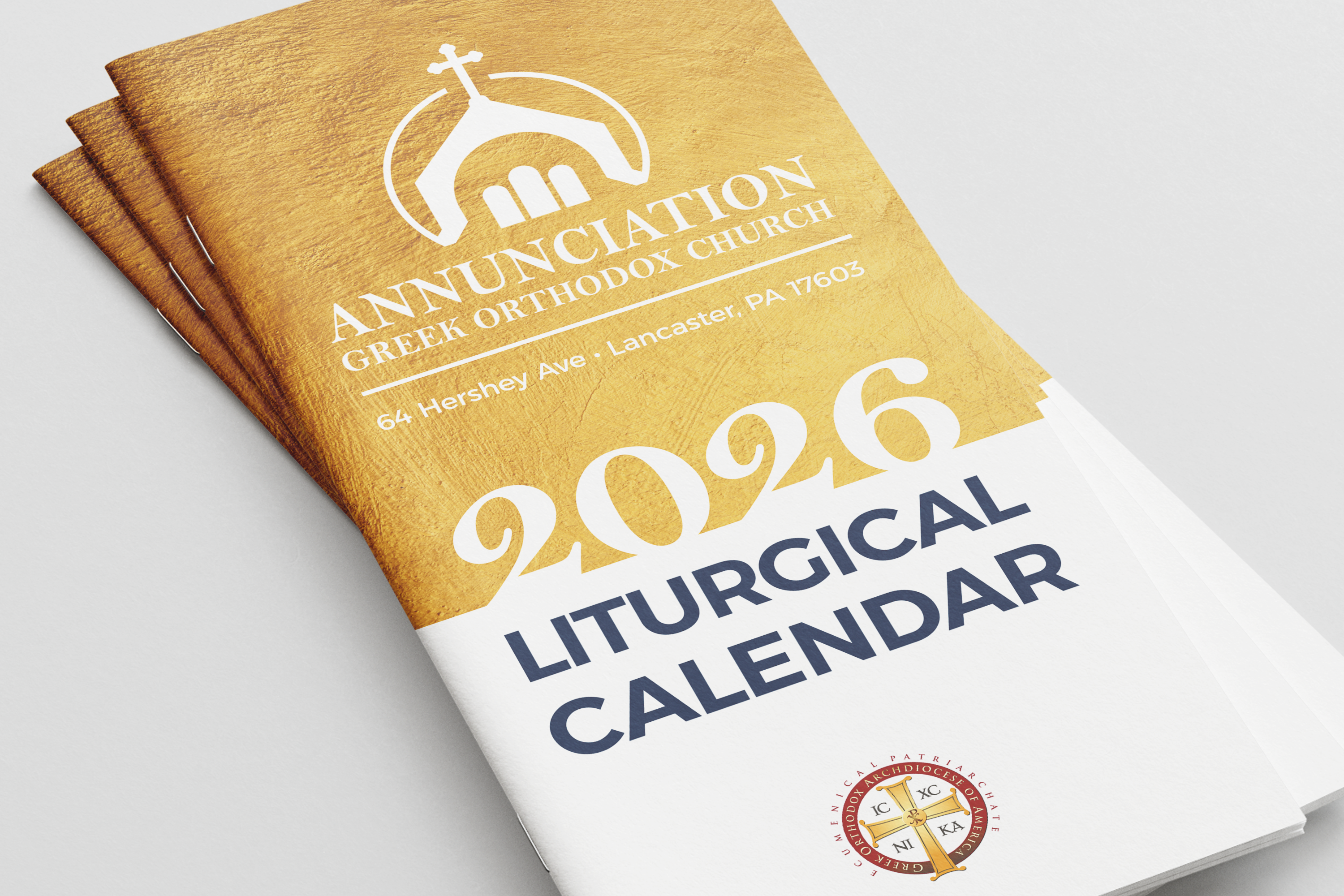
This system was built around clarity, tradition, and approachability, translating centuries of visual language into a consistent modern identity.
- Warm golds, rich blues, and deep reds anchor the system in liturgical tradition.
- The brandmark reflects the flat, structured composition of Byzantine iconography, echoing its clarity and form.
- Built to adapt across horizontal, stacked, and emblem variations for flexible use across ministries and applications.